Client –
a bit of color & FRIENDS
The Challenge –
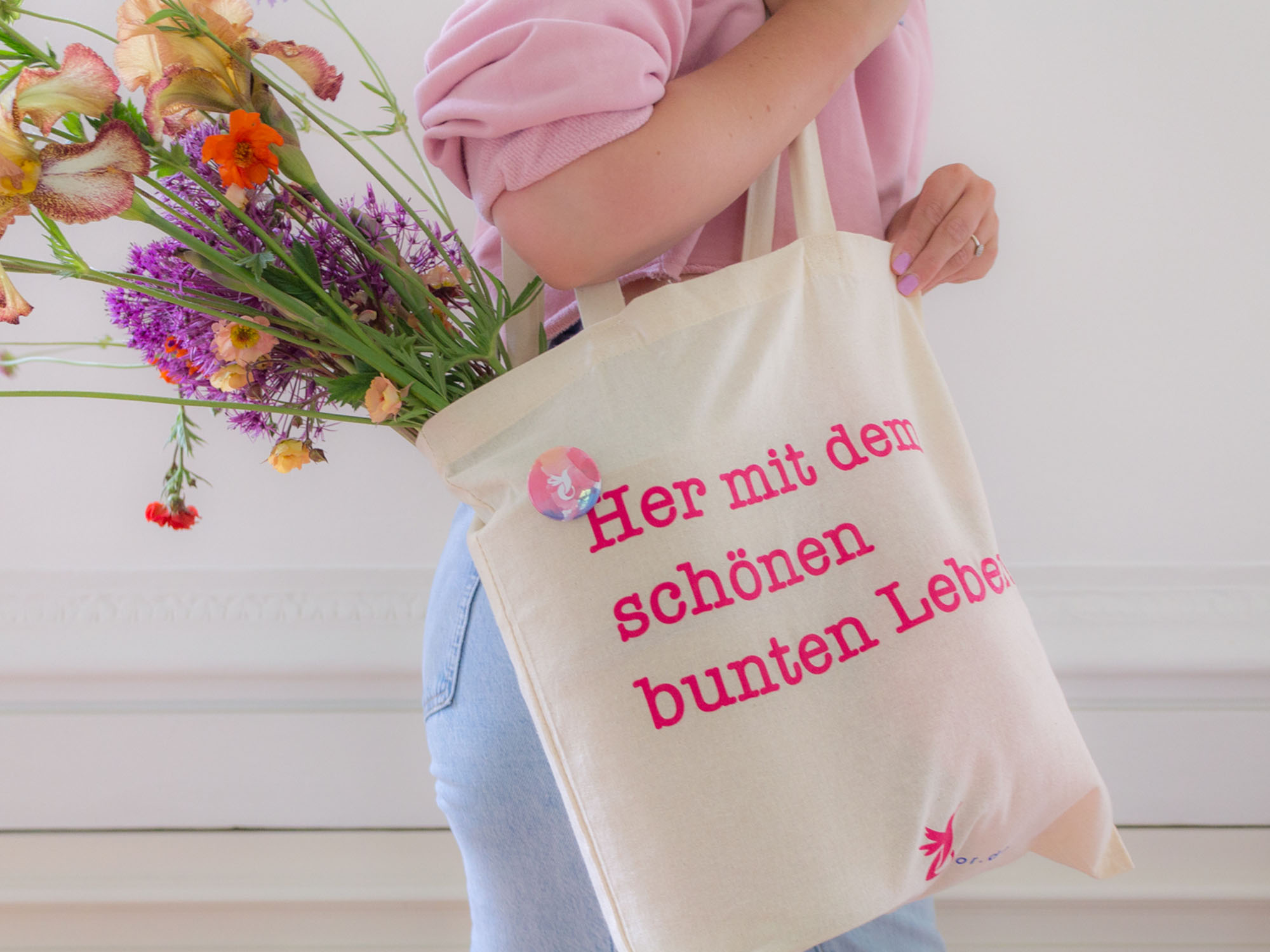
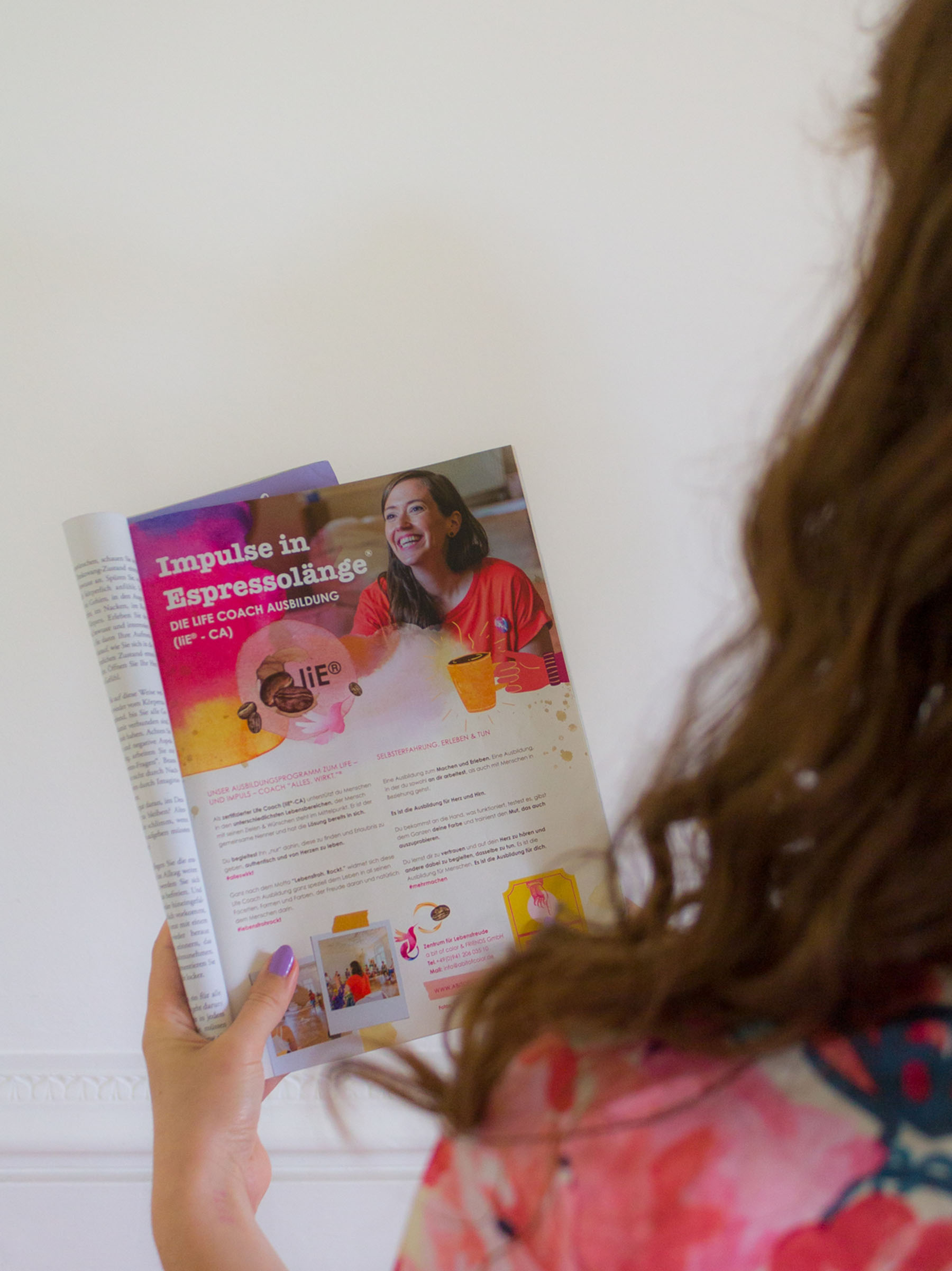
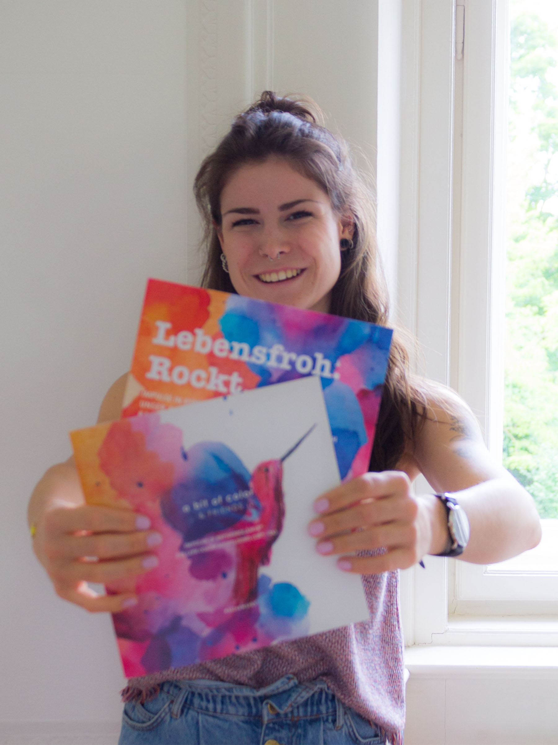
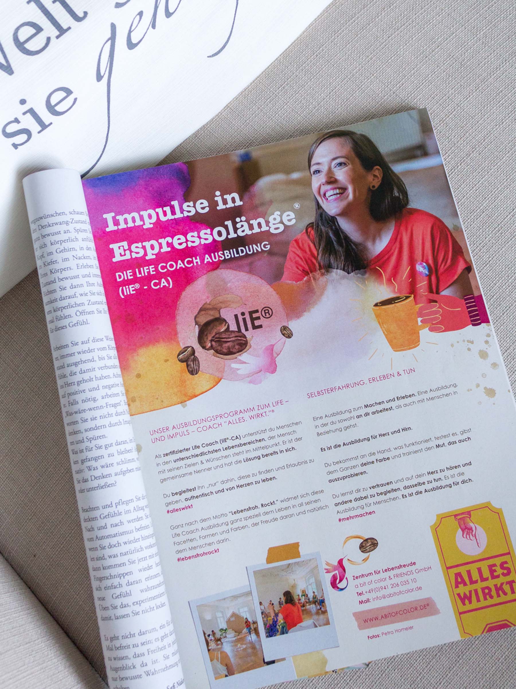
Creating a colorful, bold and remarkable branding to give shape to Veronika’s future ideas and extremely inspiring world. The new design should work across several pieces and fit the location, an old castle in Regensburg.


Left: first logo, when a bit of color was more focused on 1 to 1 coaching.
Right: a bit of color grew up, became friends an a special place for workshops, coaching, and a lot more!
Approach –
a bit of color & FRIENDS is a place to finding motivation and finding yourself.
The concept, based on living a colorful, true and happy life with the positive energy of a good network and cooperation, was the perfect trigger for designing a visual world where imagination has no limits.
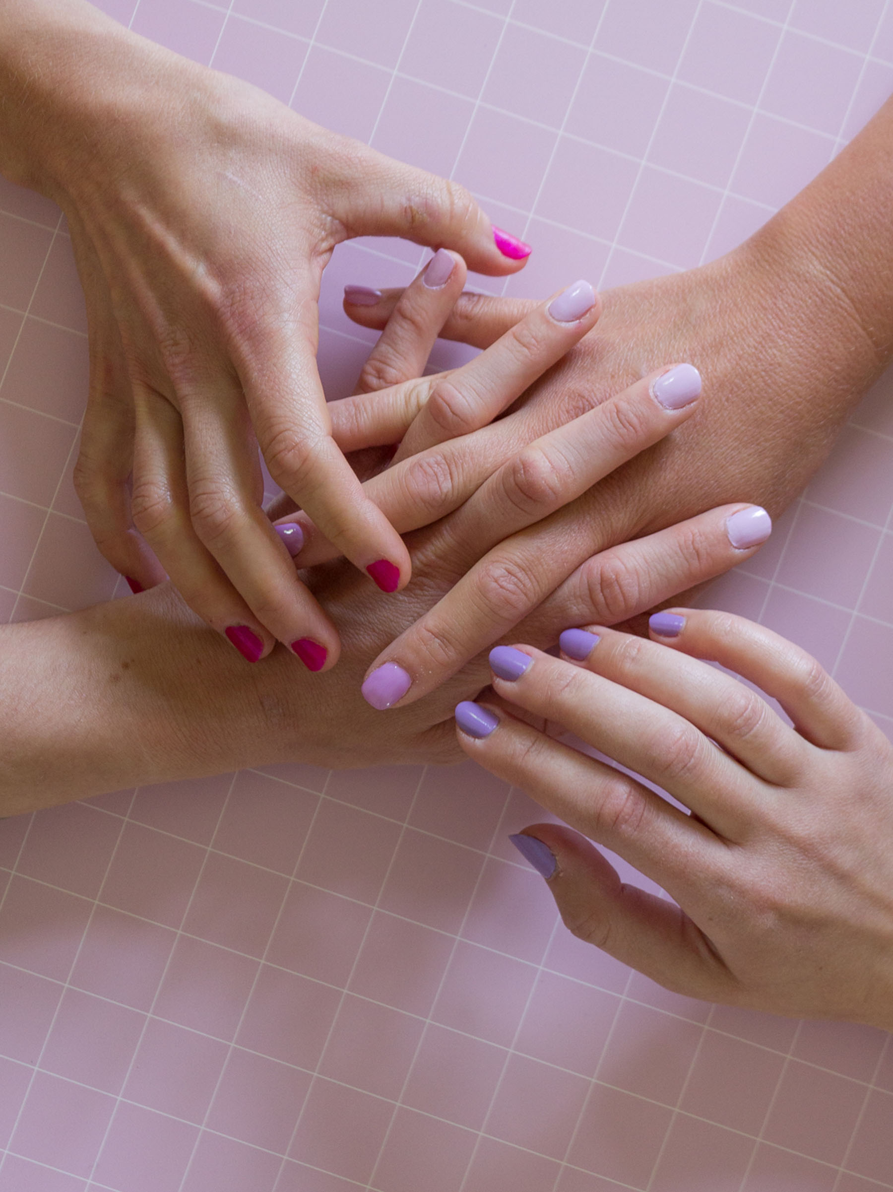
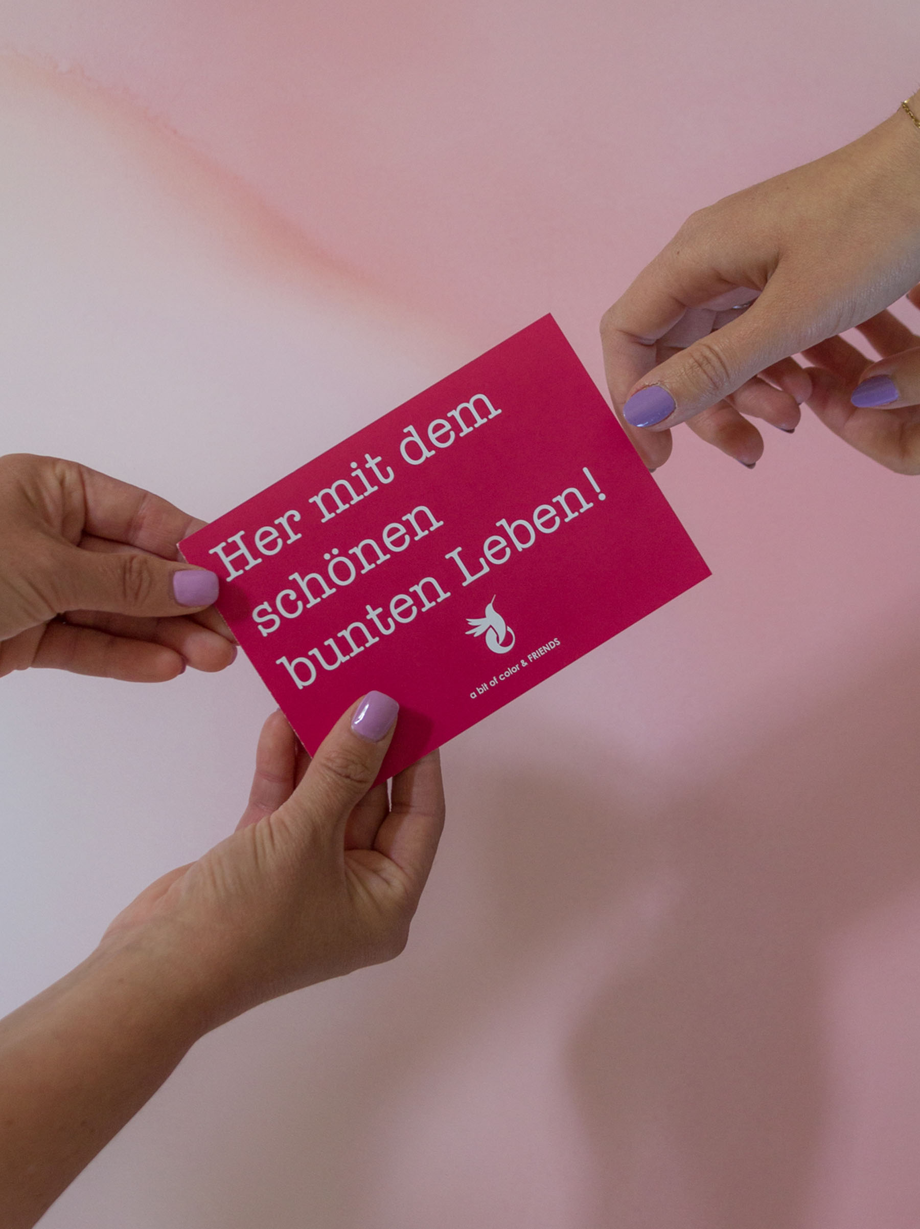
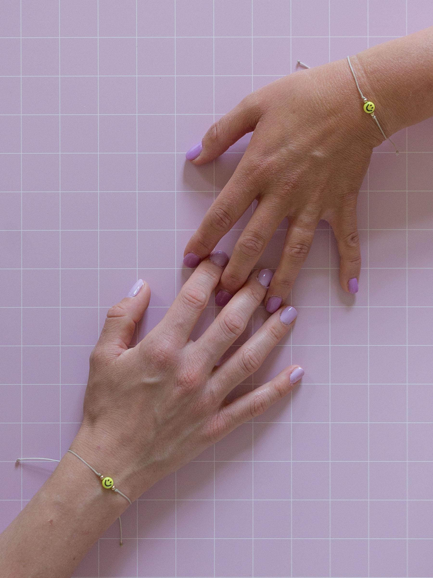
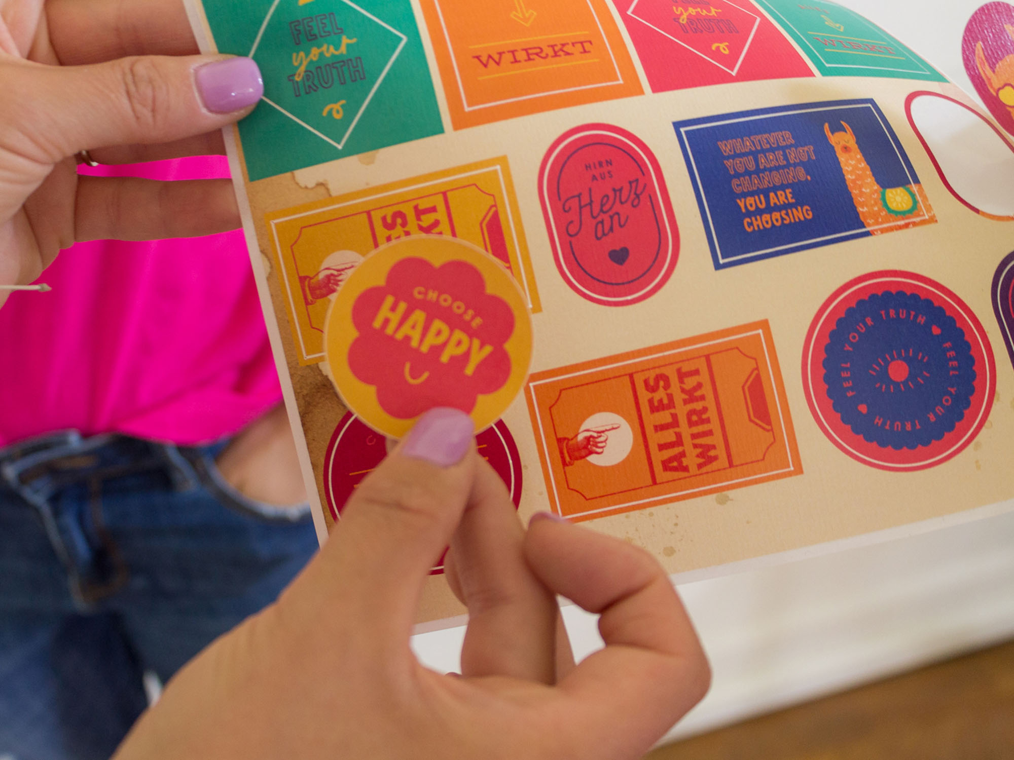
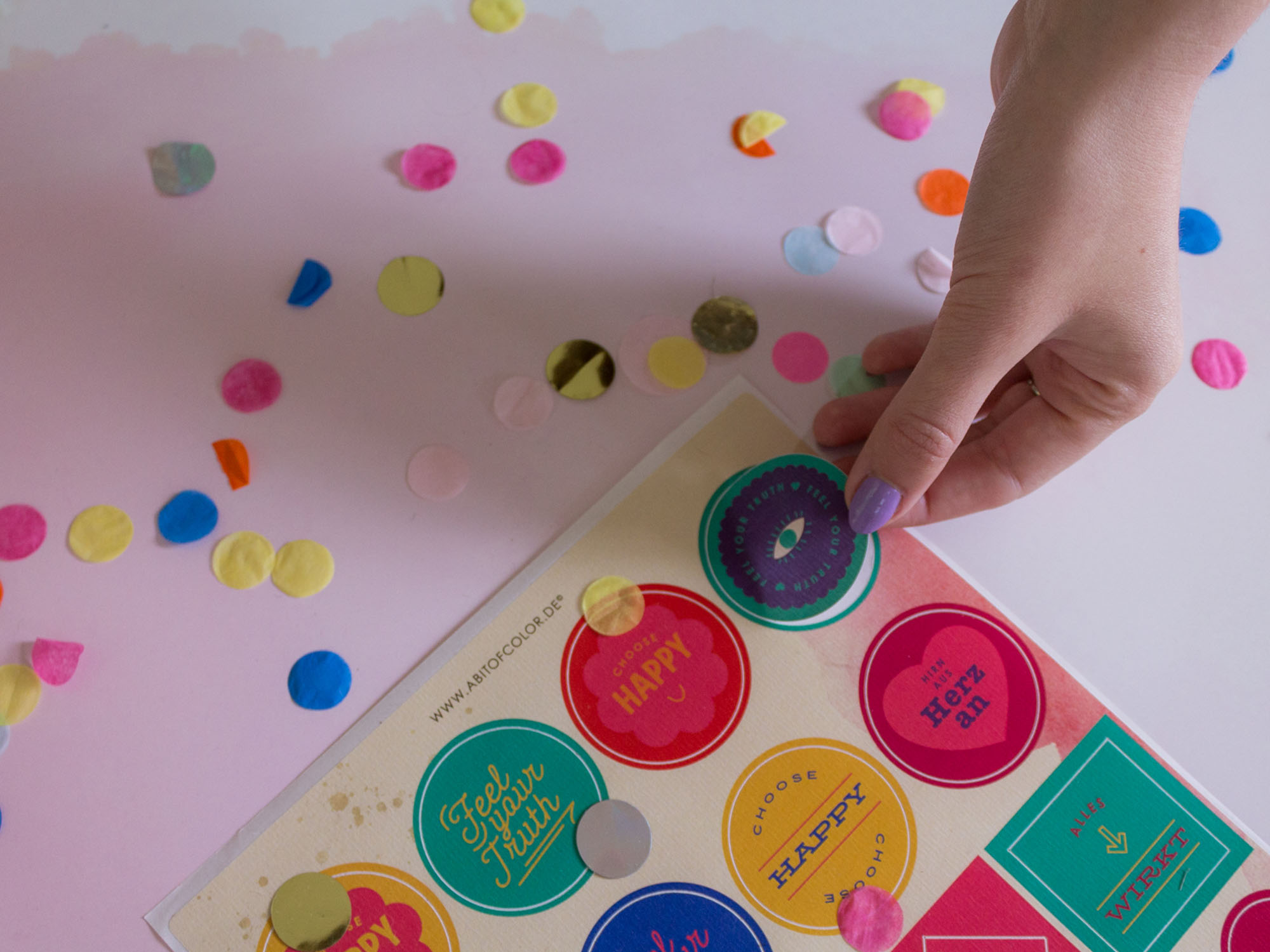
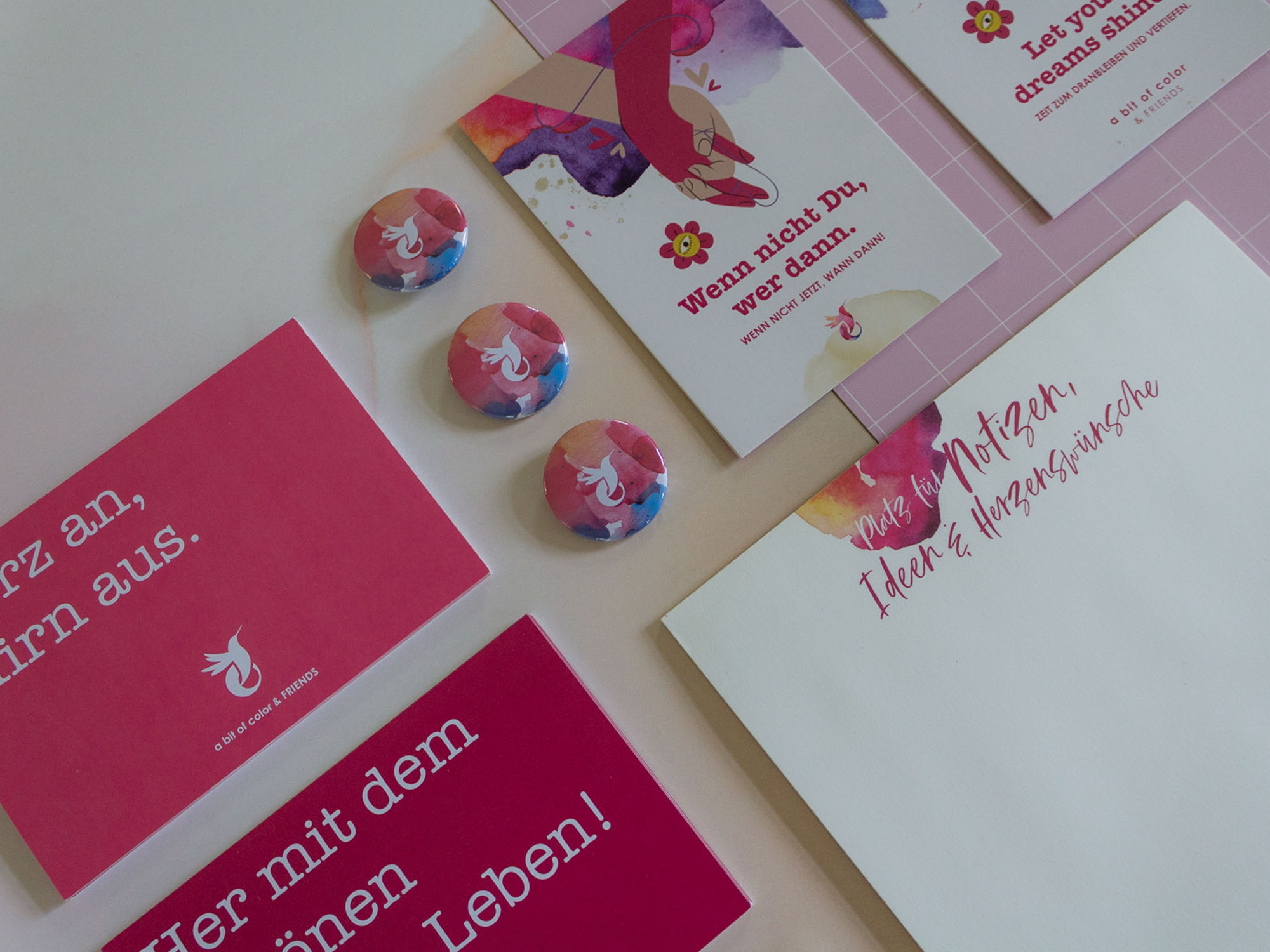

Keywords like colorful, your best self, life coach, fun, lightness, focus, love and joy, are essential to Veronika's work. She, and her team, pay attention to every detail and you experience this since you make your first contact to when you visit the "Zentrum für Lebensfreude". A magical space, located in a fresh, green area, in Regensburg.
Our Solution –
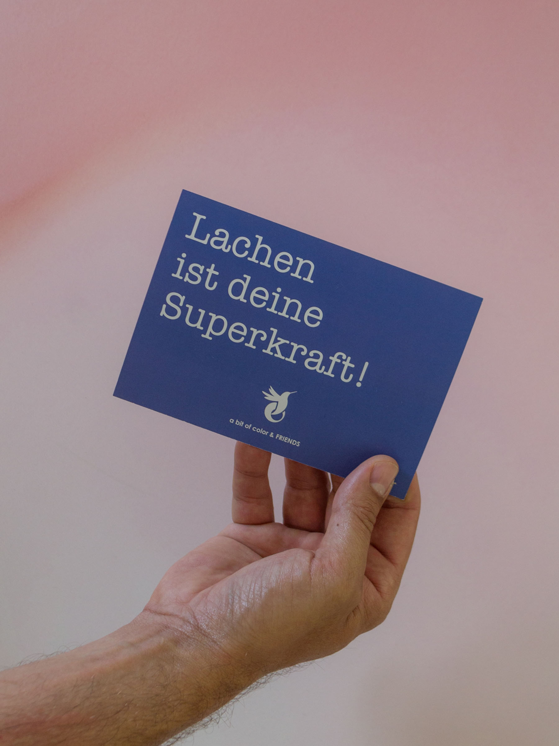
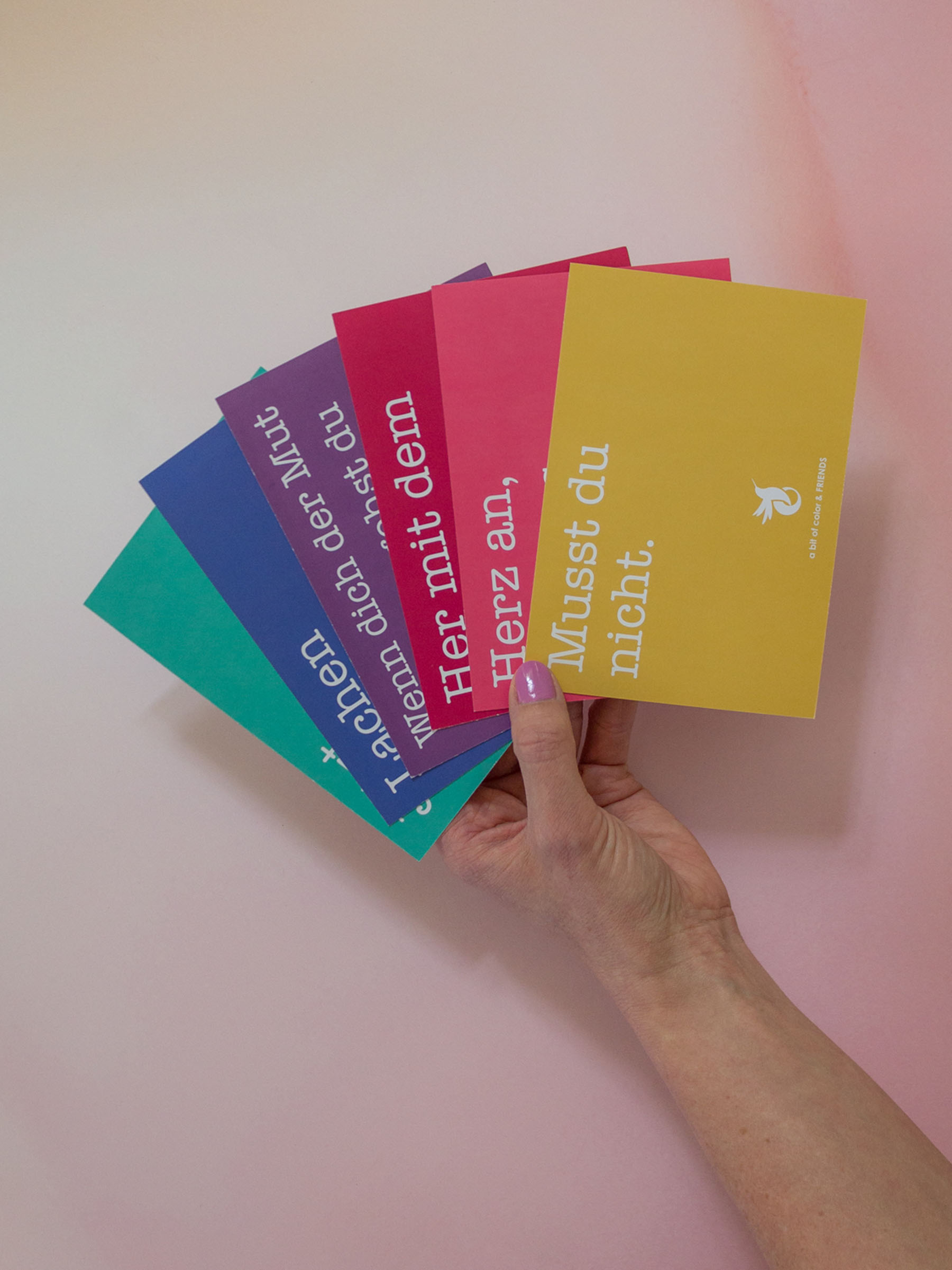
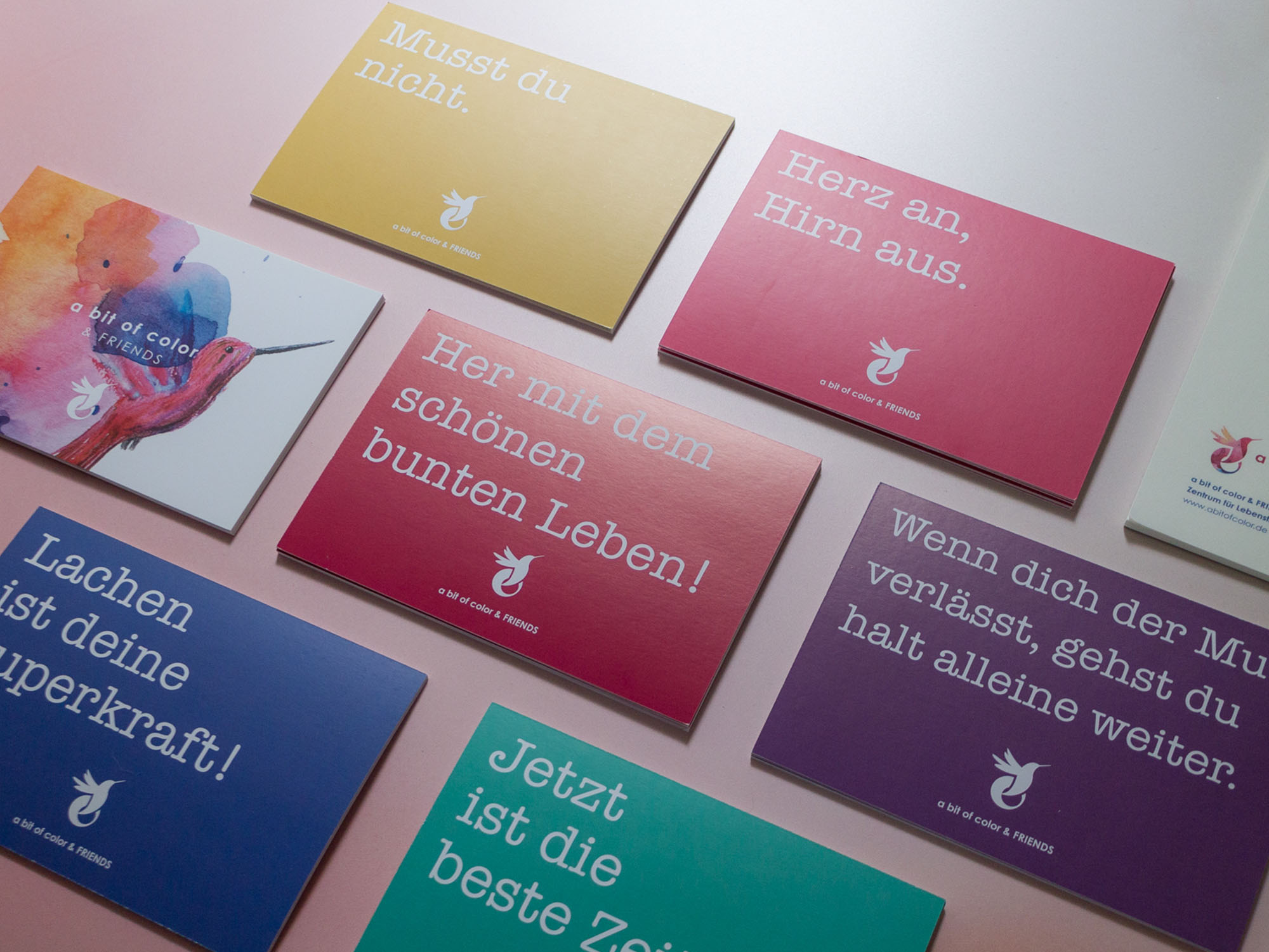
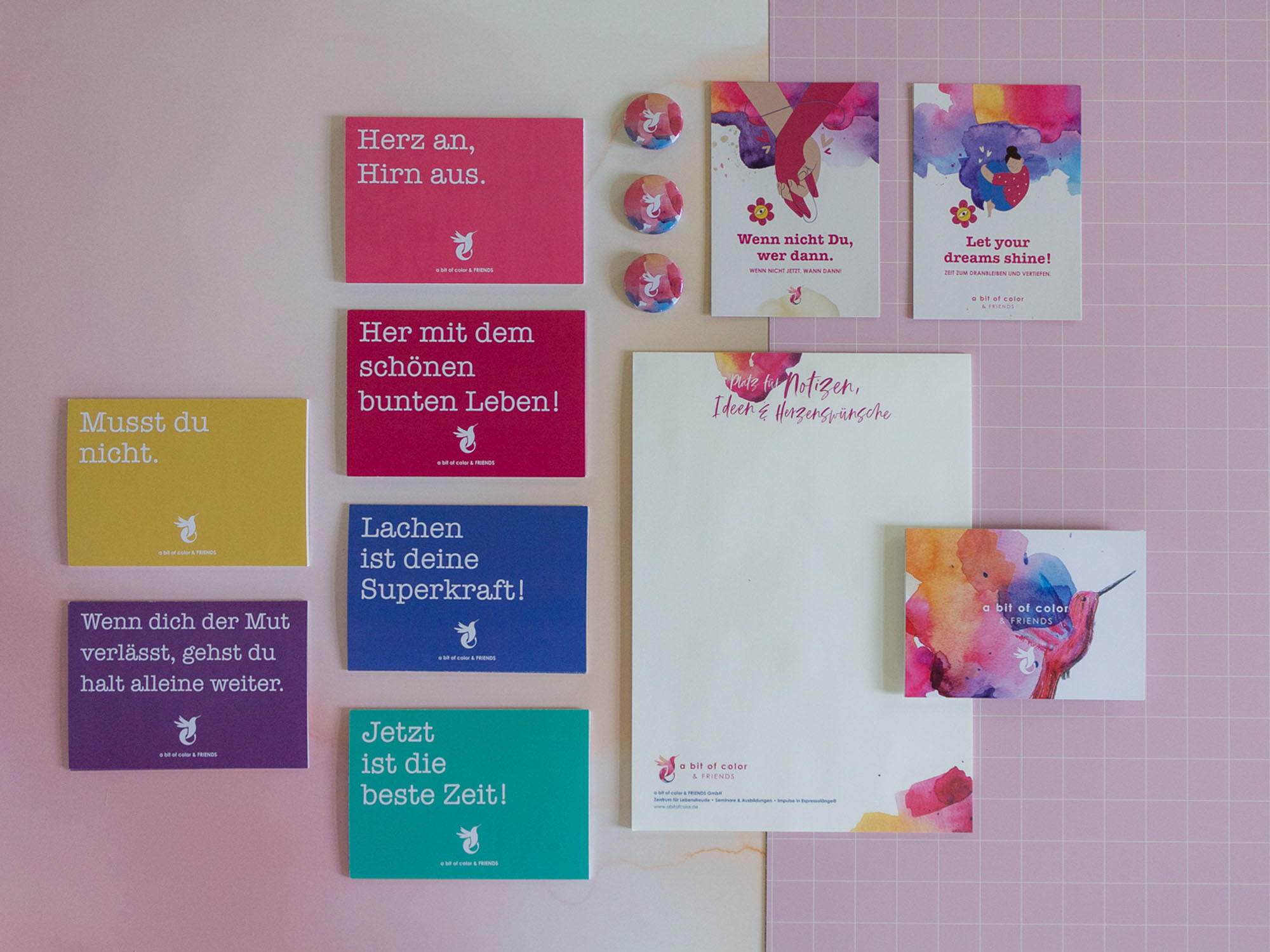
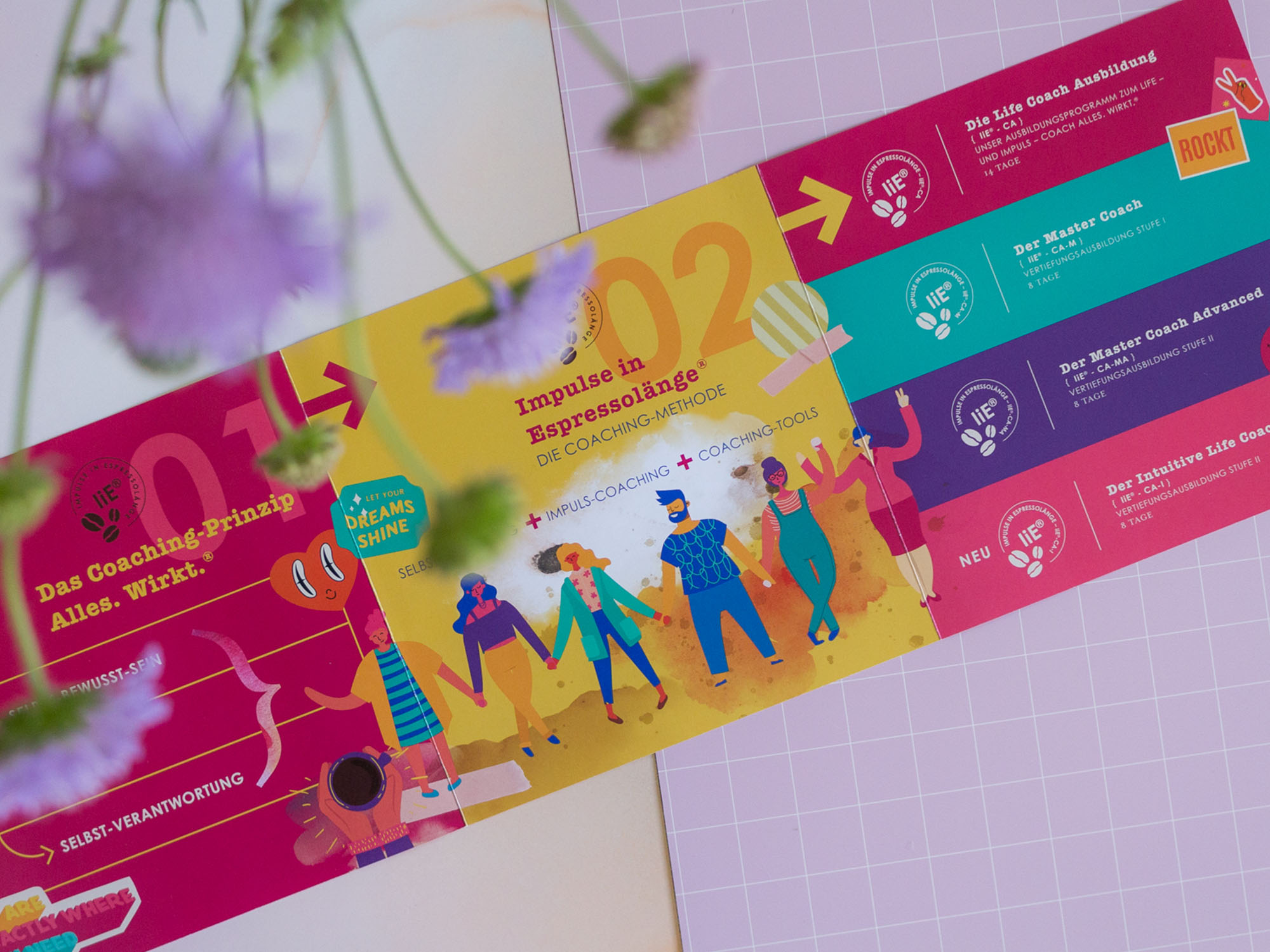
For this jouyful way of making business and facing life, we created a vivid and dynamic graphic world with two faces.
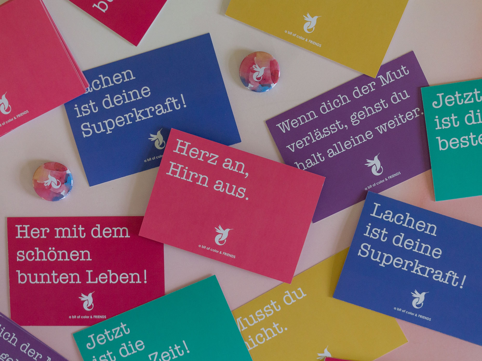
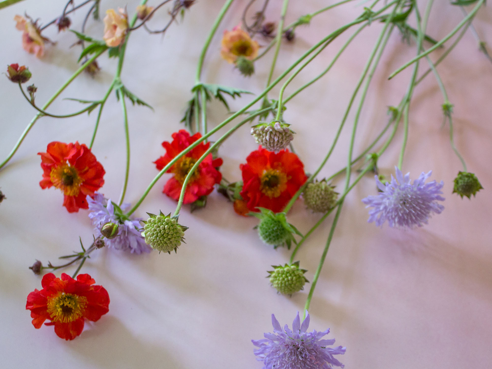
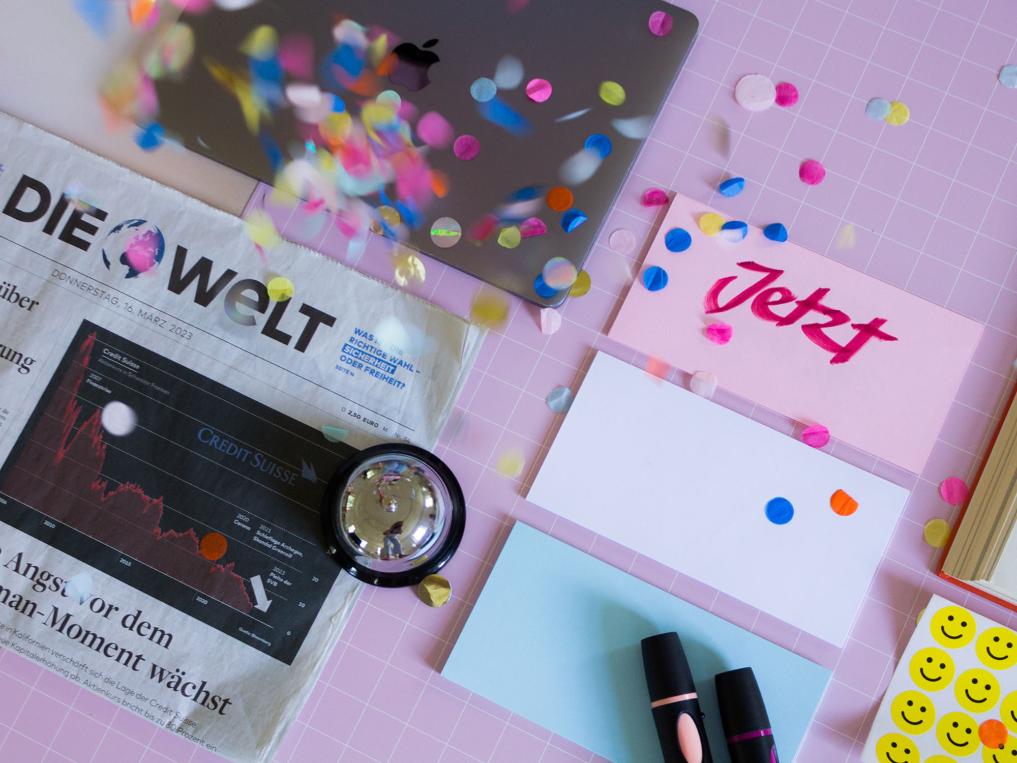
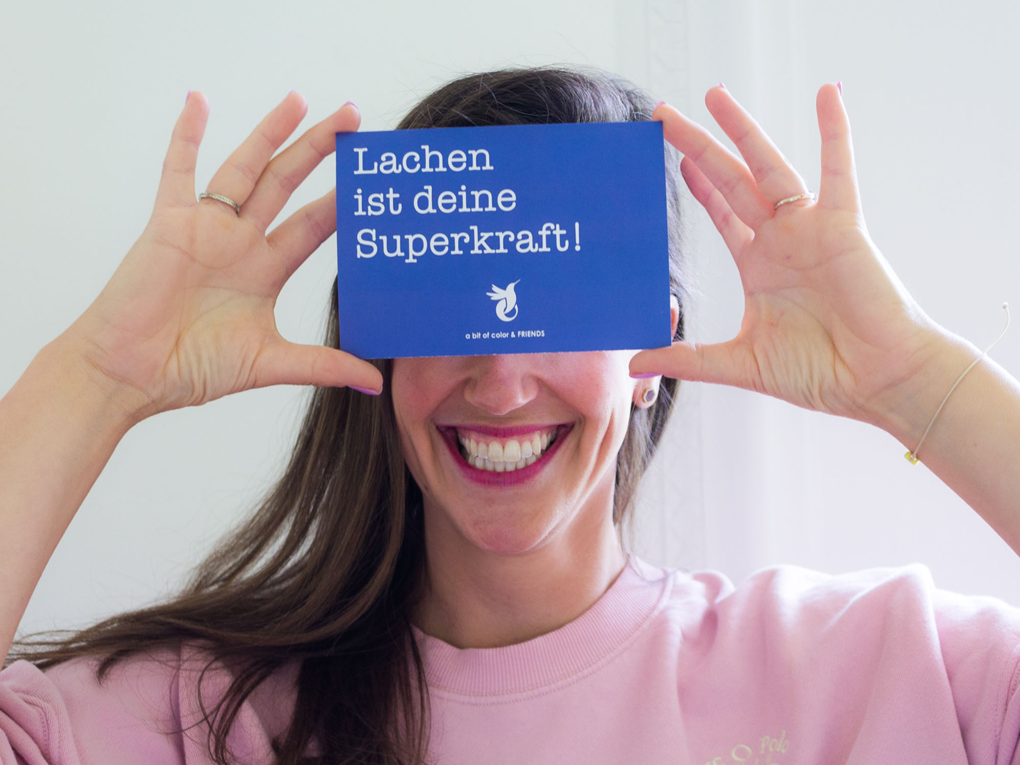
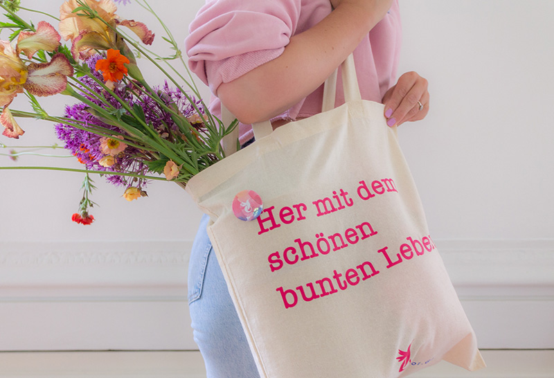
It's a visual world combining strong color block layouts with a more subtle, dreamy style. The first conveys energizing quotes, the second reveals details in a playful, inviting way.
The result, an identity as colorful and positive as Veronika and her team!

More Projects
[hantwerck]Integral Branding
a bit of color & FRIENDSIntegral Branding
Heavens Taste - feine PatisserieIntegral Branding
Womempower x EasterStyling & Product Photography
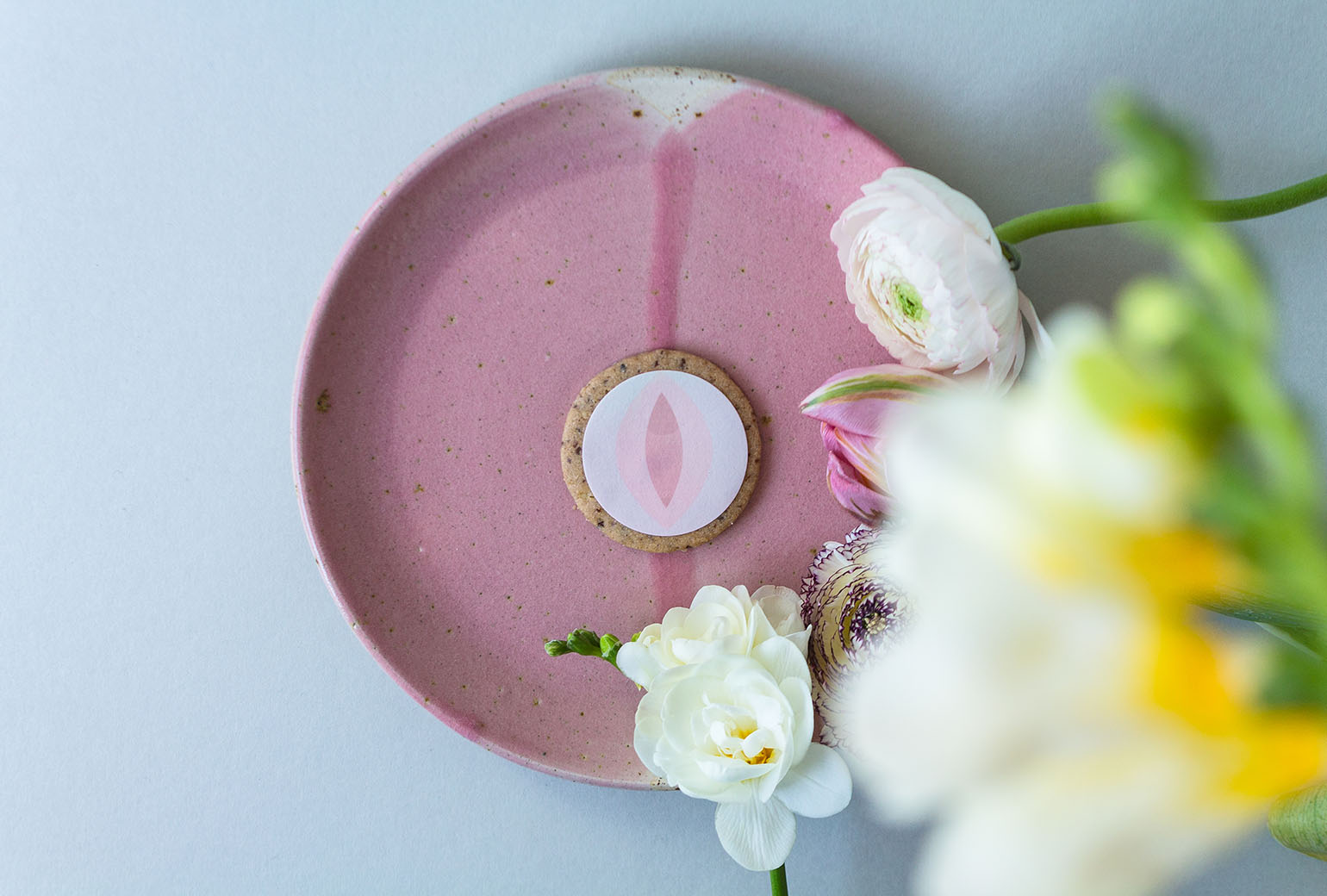
[ hantwerck ] x KeksZauberProduct Photography
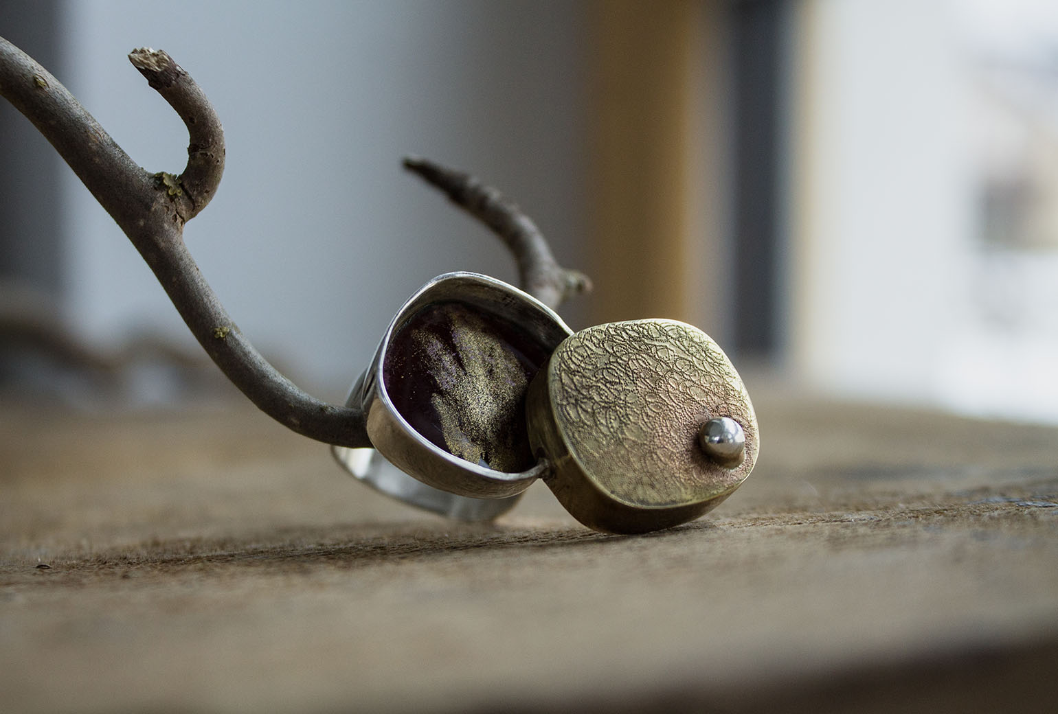
Maika JewelryStyling & Product Photography

Jivamukti YogaCorporate Identity

Ars BotanicaCorporate Identity

Jivamukti Yoga BernArt Direction & Digital Design
Let's connect!
Lass uns vernetzen und dein bestes Print- oder digitales Erscheinungsbild für deine Marke oder Projekt gestalten!